Design in 2026 is no longer just about pixels; it's about physics, immersion, and intelligence. As we move beyond the flat screens of the early 2020s, mobile interfaces are becoming deeper, smarter, and more responsive than ever before.
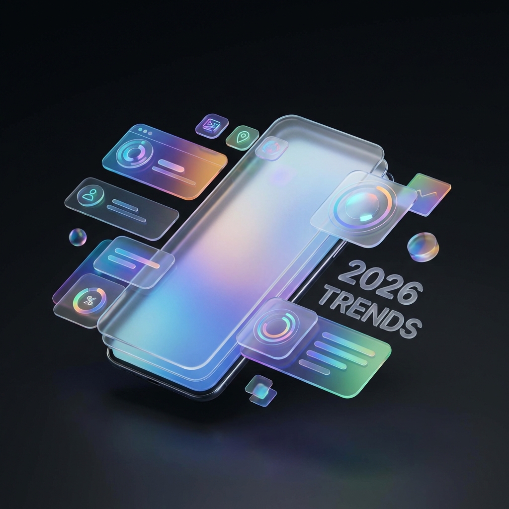
1. Holographic Materialism (Neo-Glassmorphism)
The "flat" era is officially dead. In 2026, we are witnessing the rise of Holographic Materialism. This isn't just a return to skeuomorphism—it is a sophisticated evolution of glassmorphism.
Designers are now using multi-layered blurs, realistic light refraction, and iridescent gradients to create interfaces that feel like physical objects made of future materials. Buttons don't just sit on a screen; they catch the light as you tilt your device.
- Dynamic Refraction: Background elements warp slightly behind foreground panes, creating a true sense of optical depth.
- Aurora Gradients: Static colors are replaced by moving, living gradients that react to user touch and gyroscope movement.
- Diamond Borders: Ultra-thin, high-contrast borders that mimic the edge of cut glass or crystal.
2. AI-generated, "Liquid" Interfaces
Static layouts are becoming a thing of the past. With the integration of on-device AI, apps now generate their UI in real-time based on the user's current context. This is known as Liquid UI.
Imagine a music app that completely changes its layout when you are driving (large buttons, voice-first) versus when you are exploring a playlist at home (rich visuals, detailed metadata). The "trend" is the absence of a fixed interface.
3. The Return of the Z-Axis
Spatial computing headsets have influenced mobile design heavily. Even on standard phone screens, we are seeing a massive push towards 3D elements.
"2026 is the year we stopped designing for 2D planes and started designing for 3D spaces, even on handheld devices."
This manifests in "parallax scroll" effects that are not just decorative but functional—helping users understand the hierarchy of information by physically separating layers of data.
4. Micro-Interactions 2.0: Haptic Symphony
Visuals are only half the story. The best apps of 2026 use advanced haptics to create a "tactile language." You don't just see a success animation; you feel the "click" of the digital lock snapping into place.
Designers are pairing specific haptic textures with specific actions (e.g., a "sandpaper" grit feeling when deleting a file, vs. a "smooth marble" slide when archiving), creating a multisensory experience that improves accessibility and delight.
5. Dark Mode as the Default
Dark mode is no longer an optional toggle; for many premium apps, it is the only mode.
But this isn't the stark #000000 black of OLEDs past. It is a rich, deep charcoal, midnight blue, and deep violet palette. These colors reduce eye strain while providing the perfect canvas for the neon accents and glowing holographic elements that define the 2026 aesthetic.
Conclusion: Designing for Emotion
The common thread across all these trends is emotion. Users are tired of sterile, corporate, "safe" designs. They want apps that feel magical, playful, and futuristic.
As a developer or designer in 2026, your goal isn't just to make it usable used to be enough. Now, you have to make it feel amazing.